Top 40 Awesome CSS Interview Questions & Answers You should know | CSS Tutorial
Top 40 Awesome CSS Interview Questions
💡 What is The Viewport?
The viewport is the user’s visible area of a web page.
HTML5 introduced a method to control the viewport, through the tag.
<meta name="viewport" content="width=device-width, initial-scale=1.0">
initial-scale=1.0 part sets the initial zoom level when the page is first loaded by the browser. width=device-width part sets the width of the page to follow the screen-width of the device
💡 Explain box-sizing?
The box-sizing property defines how the width and height of an element are calculated – should they include padding and borders, or not.
There are four possible value of box-sizing –
content-box – This is Default. The width and height properties include only the content. Border and padding are not included.border-box The width and height properties (and min/max properties) include content, padding, and border.initial Sets this property to its default value.inherit Inherits this property from its parent element.
💡 Explain box-shadow?
It is used to implement shadows to an element.
box-shadow: 5px 10px 8px #888888;

box-shadow: h-offset v-offset blur color.
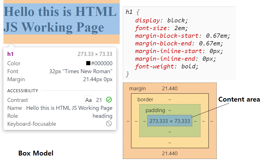
💡 Explain box-model?
Box-model is a rectangular box that is generated for elements in DOM. Each box has a content area and optional surrounding padding, border, and margin areas.
💡 What are embedded style sheets?
When all styles of HTML documents are defined in a single place using the tag of HTML documents. So this is called Embed Style Sheet.
💡 What are pseudo-elements?
Pseudo-elements keywords are used to set the style of a specific part of the selected element.
Some example are – :before, :after, :first-line, :first-letter etc.
p::first-line {
  color: #ff0000;
}

Note: The ::first-line, ::first-letter pseudo-element can only be applied to block-level elements.

h1::before {
  content: '@';
}
h1::after {
  content: '--';
}
💡 Explain some pseudo-classes?
:active, :checked, :disabled, :focus, :hover, :invalid, :nth-child(n), :nth-last-child(n), :required, :valid.
💡 What is the difference between double and single colon notation in pseudo-element “::” and “:”?
In CSS1 and CSS2, The single-colon syntax was used for both pseudo-classes and pseudo-elements.
But in CSS3 for pseudo-element, double colon notation replaced single colon notation.
For backward compatibility, the single-colon syntax is acceptable for CSS2 and CSS1 pseudo-elements.
💡 What is the ruleset?
Rulesets can be used to identify the selectors attached to one another
💡 Explain em, rem unit, vh and vw?
em – relative to the font size of the element. 4em means 4 times the size of the current font. If the font size is 16px then it will be equal to 1em.
so 2em will be 32px.
rem – Relative to font-size of the root element
vh – Relative to 1% of the height of the viewport
vw – Relative to 1% of the width of the viewport
💡 What are Contextual Selectors?
ol li {
  margin-top: 1em;
}
The selector “ol li” will select any “li” that is inside an “ol” element but not other list items. So Selector that is used to select special occurrences of an element is called a contextual selector.
💡 What is the RGB stream?
RGB is a system of representing a certain color in CSS. There are three streams in this nomenclature representing a color, namely the Red, Green, and Blue stream. The intensity of the three colors is represented in numbers ranging from 0 to 256.
💡 Difference between visibility: hidden and display: none?
display: none – Element is removed from DOM at all and no space allocated for this.visibility: hidden – Element is not completely removed, it just hides from DOM, and space is allocated for it on the page.
💡 Explain position property?
position relative works as a normal flow. We can set top, left, bottom, and right to move the box from where it would normally be displayed.
If we apply absolute, the element removed from the normal flow. The item will then be positioned relative to its containing block or with a viewport.
When we use fixed position and do scroll page, an element is fixed in the page based on the provided value of offset top, right, left, or bottom. Rest of the content in normal flow scrolls as usual.
.item {
    position: relative;
    bottom: 50px;
}

.item {
    position: absolute;
    top: 20px;
    right: 20px;
}

.item {
    position: fixed;
    top: 20px;
    left: 100px;
}
💡 Explain position: sticky?
.sticky {
    position: sticky;
    top: 0;
}
When we apply position sticky to an element, it also requires a threshold limit by setting value for at least one of the top, right, left, bottom properties. When we scroll an element crosses to its threshold value, it becomes fixed.
💡 Explain display: flex or FlexLayout?
This method is designed for a one-dimensional layout. When we have to design a layout in rows and columns, we can use a flexbox layout. Direct items of this flexbox become flex items and positioned in a row.flex-direction property is used to set flex items in a row or a column. The default value is the row.
We can also change the direction of items on the main axis by using the flex-direction value of row-reverse or column-reverse.
There are three properties used to control the ratio of the flex items.flex-grow – When there is extra space available after giving flex-basis (like 50px), it is shared between all items.
flex-shrink – item can shrink in the situation where an overflow would happen.flex-basis – flex-basis gives a size that the item will have before any growing or shrinking takes place.
.item {
   flex: 1 1 50px;
}
container:first-child {
   flex: 1 1 0;
}
💡 Explain CSS Counters?
CSS counters are “variables” maintained by CSS whose values can be incremented by CSS rules.
body {
  counter-reset: section;
}
h1::before {
  counter-increment: section;
  content: "Sec - " counter(section) ": ";
}
💡 How can we load different stylesheets files for different media?
<link rel="stylesheet" media="mediatype and|not|only (expressions)" href="print.css">
link tag has a property like media that accepts an expression and if that expression resolved as true then only that CSS file will be executed.
💡 Explain Media Types?
screen – This is used for computer screens, tablets, smart-phones, etc.all – Used for all media type devicesprint – Used for printersspeech – Used for screenreaders that “reads” the page out loud
💡 Write some media queries?
**Syntax**

@media not|only mediatype and (expressions) {
  CSS-Code;
}
@media only screen and (orientation: landscape) {
  body {
  }
}
@media screen and (max-width: 600px) {
  body {
  }
}
@media screen and (max-width: 900px) and (min-width: 600px) {
  div {
  }
}

/* When the width is between 600px and 900px OR above 1100px - change the appearance of <div> */
@media screen and (max-width: 900px) and (min-width: 600px), (min-width: 1100px) {
  div {
  }
}
💡 What is the first CSS code required for responsive layout?
First which needs to ensure is that all HTML elements should have a box-sizing property value border-box. By doing this, padding and border are included in the total width and height of elements.
* {
  box-sizing: border-box;
}
💡 Define CSS Selectors?
CSS selectors are patterns that are used to select an element for style.
.classOne.classTwo – Select elements with both classes.
div.classOne – Select all div elements with class ClassOne.
.classOne .classTwo – Select element with classTwo that is descendent of an element with classOne.
.classOne, .classTwo – Select all elements which have classOne or classTwo classes.
div p – Select all p inside div.
div > p – Select all p where parent is div.
div + p – Select first p element that is placed immediately after div element.
div ~ p – Select all p next to the div element within the same parent.
To learn all CSS selectors. Please read here.
💡 Explain Animation property?
Animation CSS property is used to create the animated elements.
Syntex --

animation: name duration timing-function delay iteration-count direction fill-mode play-state;
animation-name - name of the keyframe that is bind to the selector.animation-duration – Specifies how many seconds or milliseconds an animation takes to complete.animation-direction – used to provide direction. Possible values are – normal, reverse, alternate, alternate-reverse;
**Example***

div {
  width: 50px;
  height: 50px;
  background: green;
  position: relative;
  border-radius:100%;
  animation: ballMove 4s infinite;
}

@keyframes ballMove {
  from {left: 0px;}
  to {left: 400px;}
💡 What is the use of the border-collapse property?
This is used to define table borders as separate or collapse.
separate – This is the default. Each cell will display its own borders.collapse – Borders are collapsed into a single border.
border-collapse: separate|collapse;
💡 How can you create a semi-transparent background color using CSS?
The CSS property that’s responsible for the semi-transparent is the background property. The background property is assigned an RGBA color value so that we can control its opacity.
background-color: rgba(0,0,0, 0,5);
💡 What are all possible properties of background css?
background-color – color value
background-image – image
background-position – value|x% y%|xpos ypos
background-size – auto|length|cover|contain
background-repeat – repeat|repeat-x|repeat-y|no-repeat
background-origin – padding-box|border-box|content-box|
background-clip – border-box|padding-box|content-box
background-attachment – scroll|fixed|local
💡 Explain background-position property?
This property is used to set the background-position of an image. The default position is the top left of the page. The positions that can be set include top, bottom, left, right, and center.
img {
background-image: url('abcd.png');
background-repeat: no-repeat;
background-attachment: fixed;
background-position: center;
}
💡 How can you style every third item in a list, starting with Index 2 using “:nth-child ” pseudo-class?
li:nth-child(3n + 2) {
 background: red;
}
The above pseudo-class will execute from index 2 and then for every third element.
Using a formula (an + b). Description: a represents a cycle size, n is a counter (starts at 0), and b is an offset value.
p:nth-child(3n + 0) {
  background: red;
}

// it will start from 3rd index and then will continue for every 3rd element.
💡 Explain Grid layout or display grid?
Display: grid – is used to create a grid-based layout system with rows and columns without float and position properties.
.grid {
  display: grid; // can use inline-grid also
}
We can adjust the gap between rows and columns using properties: grid-column-gap, grid-row-gap or grid-gap
grid-template-columns - This property specifies the widths of columns in a grid.
** 4 column layout of different widths.
{
 grid-template-columns: 30px 200px 40px 100px;
}

** First row height is 100px and second row height is 300px;
{
 grid-template-rows: 100px 300px;
}

** Auto width layout
{
 grid-template-columns: auto auto auto auto;
}
Read here more –
https://www.w3schools.com/css/css_grid.asp
💡 Create a Column responsive layout using flex and media queries?
You can check code:
https://www.w3schools.com/code/tryit.asp?filename=GOB0PEIQKGVI
<style>
* {
  box-sizing: border-box;
}
/* Container for flexboxes */
.row {
  display: flex;
  flex-wrap: wrap;
}
/* Create four equal columns */
.column {
border: 1px solid black;
  padding: 20px;
  margin: 5px;
  flex: 20%;
}
</style>
💡 What is the CSS output of the below code?
<style>
 .classOne {color: yellowgreen};
 ul a {color: green};
 ul li a {color: blue};
 a {color: red}
</style>

<ul>
	<li>
		<a href="#" class="classOne">link</a> // yellowgreen
	</li>
 </ul>

// if we remove ".classOne" css then it will apply "ul a" css.
💡 What is the difference between “:first-child” and “:first-of-type”?
:first-child – it chooses an element if it is the first child element of the parent. If the element comes to the second position, this selector will not select that element.:first-of-type – This selector does not relate to element position but selects an element that should be first of its type.
Top 40 Awesome CSS Interview Questions
💡 CSS property Output?
<style>
   p:first-of-type {color: red}
   p:first-child {color: blue};
</style>

<h1>heading 1</h1>
<p>Paragraph 1</p>  // red
<p>Paragraph 2</p>  // no css applied
<style>
 p:first-child {background: green};
 p:first-of-type { background: red;}
 p {background: yellow; }
</style>

<h1>heading 1</h1>
<p>Paragraph One</p> // Yellow
<p>Paragraph 2</p> // Yellow
<style>
 p:first-child {background: green};
 p {background: yellow; }
 p:first-of-type { background: red;}
</style>

<h1>heading 1</h1>
<p>Paragraph 1</p> // red
<p>Paragraph 2</p>  //no css applied
<style>
 p:first-child {background: green};
 p:first-of-type { background: red;}
 p {background: yellow; }
</style>

<p>Paragraph 1</p> // green
<p>Paragraph 2</p>  // yellow
<p>Paragraph 3</p>  // yellow
<style>
  p:first-of-type {color: red}
  p:first-child {color: green};
</style>

<p>Paragraph 1</p>  // green
<div>
<p>Paragraph 2</p>   // green
</div>
<style>
  p:first-of-type {color: red}
  p:first-child {color: green};
</style>

<body>
 <h1>Hello</h1>
 <p>Paragraph 1</p> // red
 <div>
  <p>Paragraph 2</p>   green
 </div>
</body>
Top 40 Awesome CSS Interview Questions
JavaScript Console Interview Questions | Input Output Program
JavaScript Interview Questions & Answers for Experienced – Part 1
JavaScript Increment & Decrement Input Output Questions & What is x++ & var x = x++ ???
Top 40 Awesome CSS Interview Questions
instagram oto beğeni
Hi there it’s me, I am also visiting this web page regularly, this web site is actually pleasant and the people are
really sharing pleasant thoughts.
ucuz takipçi satın al
Hi there, I read your blogs on a regular basis. Your story-telling style is witty, keep up the good work!